AINS Brand Redesign Overview
When I arrived at AINS, I was the first UI/UX designer the company had hired full-time in its nearly twenty-year history. It boasted of two flagship software (SaaS and PaaS) products in its portfolio. They needed help crafting better user experiences, and were hoping to modernize their product’s user interface. At the same time, they needed a complete redesign of their public website, and they needed help rebranding the entire company, to help it find a better footing in a very competitive marketplace.
AINS Corporate Website Development
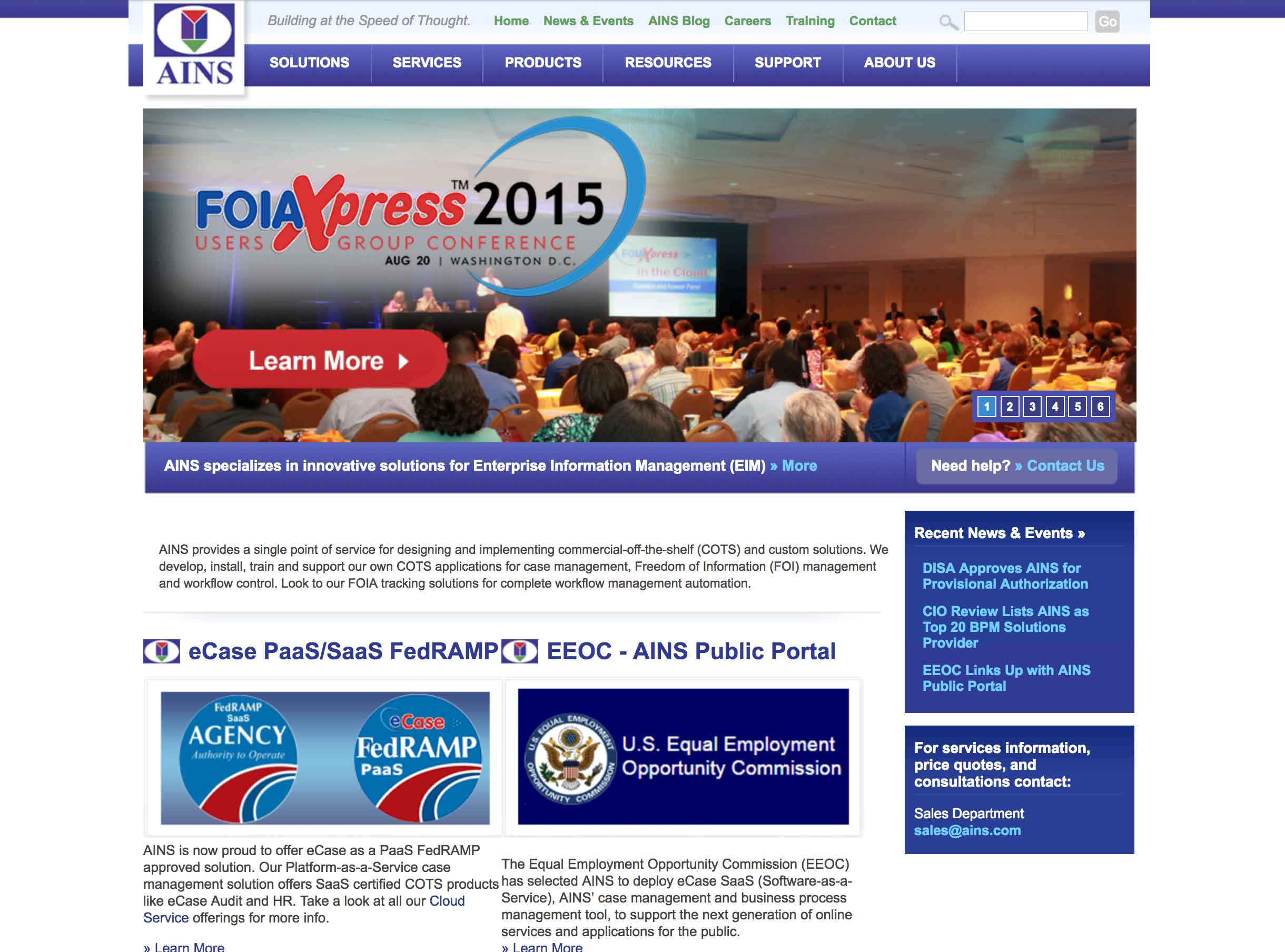
Before.
When I joined the company I inherited a seven-year-old Squarespace site with a struggling hierarchy and a message that had become lost amid the plethora of information that was kept on each page.


After.
This is what I left behind. A two font-family site, (three if you count Font Awesome) with a purposeful hierarchy, a refined message, a modern design, and A+ ratings across the board on Pingdom and GTMetrix. The site was built using WordPress.


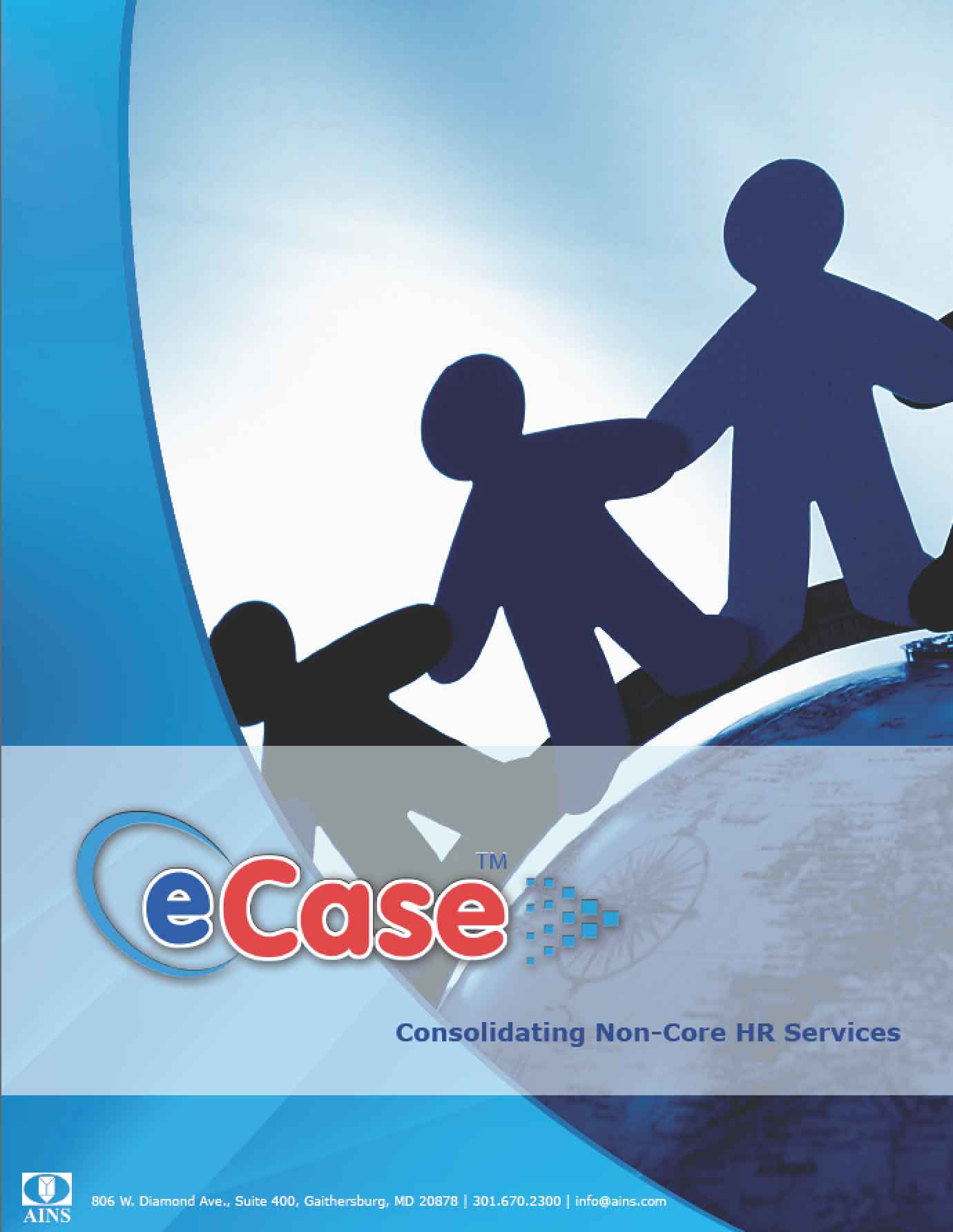
AINS Corporate Branding
The two flagship programs AINS offers is eCase, a Case management platform, and FOIAXpress, a service built on eCase that helps with Freedom of Information Act requests, for the government.
When I arrived, the corporate identity, AINS, eCase and FOIAXpress had three very different styles and color pallets. They each had unique fonts in their logos and many variations of each logo in circulation. In order to begin the corporate rebranding project, I had to start with the basics: font, colors, and logos.
I chose Google’s Raleway for headline font and Open Sans for all paragraph text. I was not permitted to change the corporate AINS logo, so I locked down the color pallet and created new logos for eCase and FOIAXpress that would better compliment the main company identity.
The AINS logo came in about 10 different style variations. None of them had a consistent color palette or shape and every variation was in circulation. In order to bring consistency to the brand, I retired every old logo and updated it to help begin to tie all corporate entities together. I chose the darker font from one of the existing logo variations as well as the best primary colors included in other variations. The result was a simplified logo, that uses contrast and color to stand out. The colors used in the logo helped to shape the color palette for the rest of the brand.
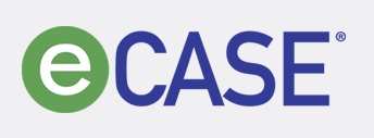
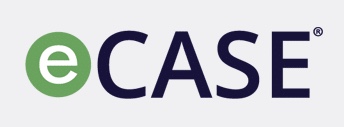
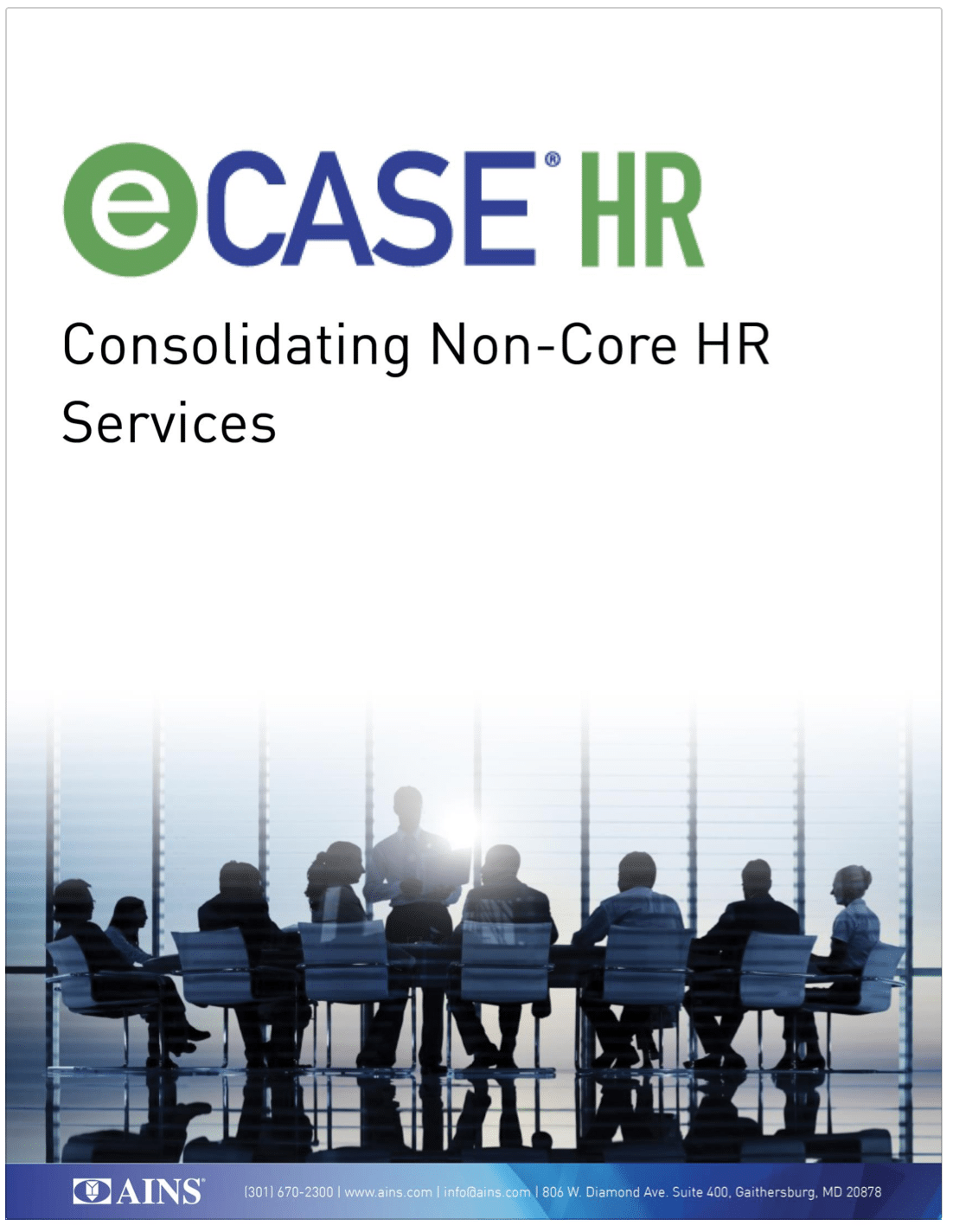
The old eCASE logo used a DINS font that the company did not own and a font that was never used anywhere else in the company. I replaced it with Google’s Open Sans. Open Sans was not nearly as compressed as the DINS font, but its readability really makes it stand out. It was for that reason, I made Open Sans the main font for all of AINS online and print material. The alignment of the green background was corrected to be even with the letters that follow, and the color of the CASE text was also changed to dark blue to match the new corporate logo font color.
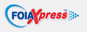
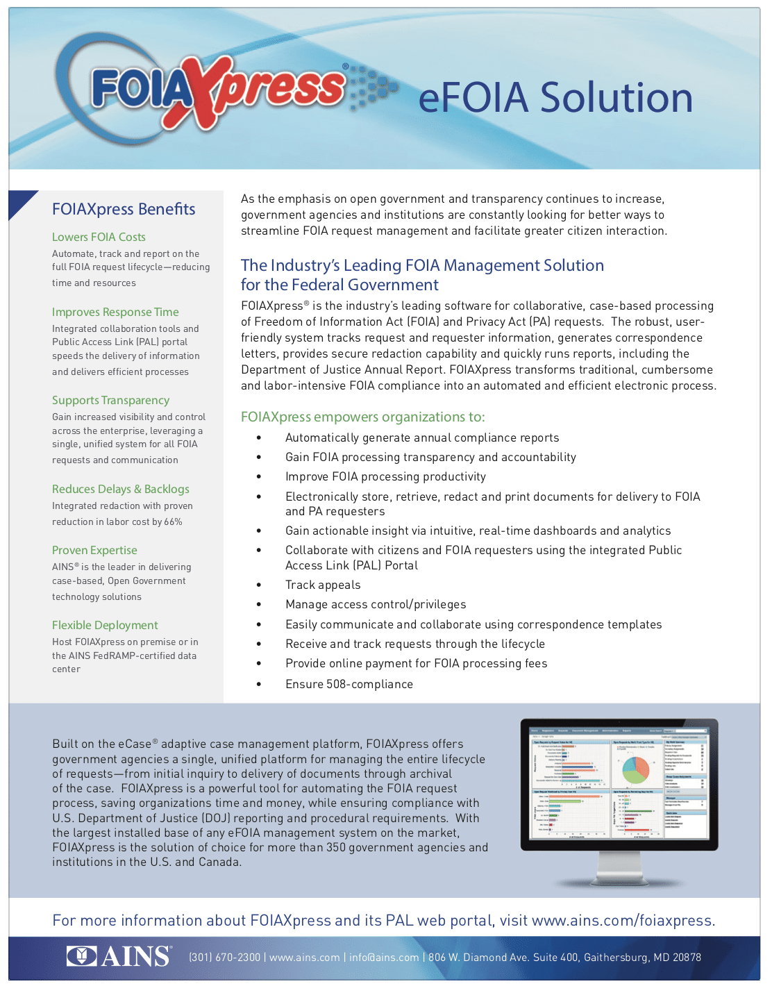
The old FOIAXpress logo utilized almost every text feature available in word processors from fifteen years ago. Bubble letters, text-outline, drop shadows with varying distances and fades, a large blue swish, a layered X that was a different shade of red than the rest of the logo, and 14 baby blue dots pointing right.
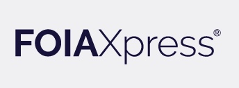
The new logo was designed for clarity and simplicity. I chose to use Raleway, a new font to AINS, that I also planned to use for all headlines. Raleway is a san serif font with a distinct stylistic twist. Like the product, FOIAXpress, Raleway is bold, elegant, and easy to recognize.
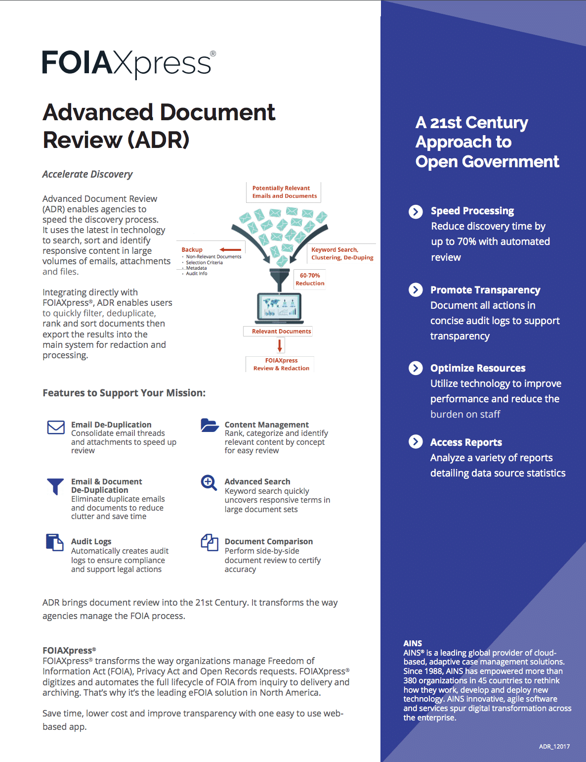
I also directed the redesign all of our marketing materials including white papers, fact sheets, brochures, case studies, PowerPoint presentations, release notes, manuals, training materials and handouts as well as the templates the company uses for proposal writing.
Almost every single part of the company’s brand was overhauled in a just a year. The resolution covered everything from the public website to internal newsletters. Nothing was left behind. Here are a few examples of that rebranding effort:
Before
After
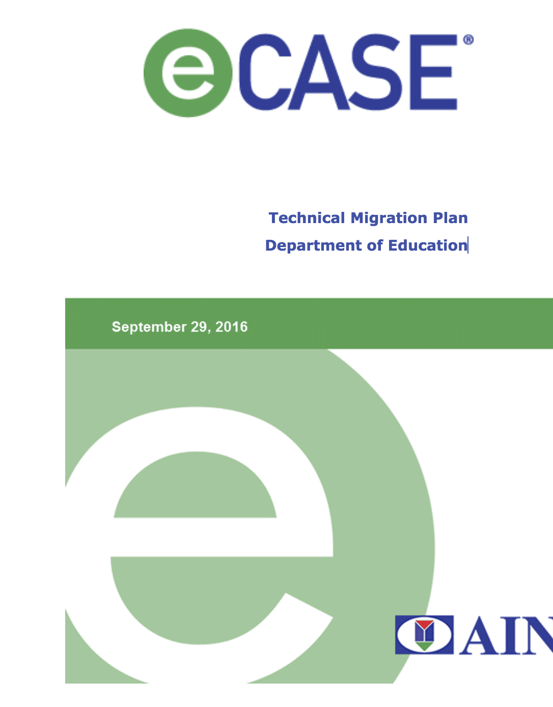
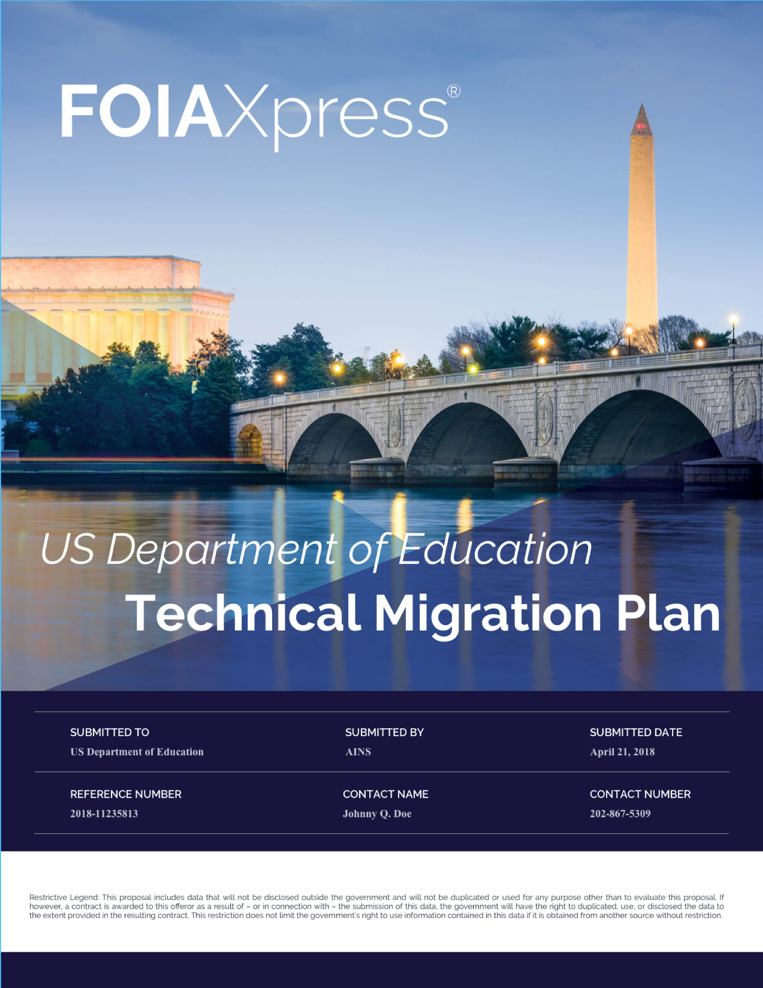
Technical Migration Plan for end users
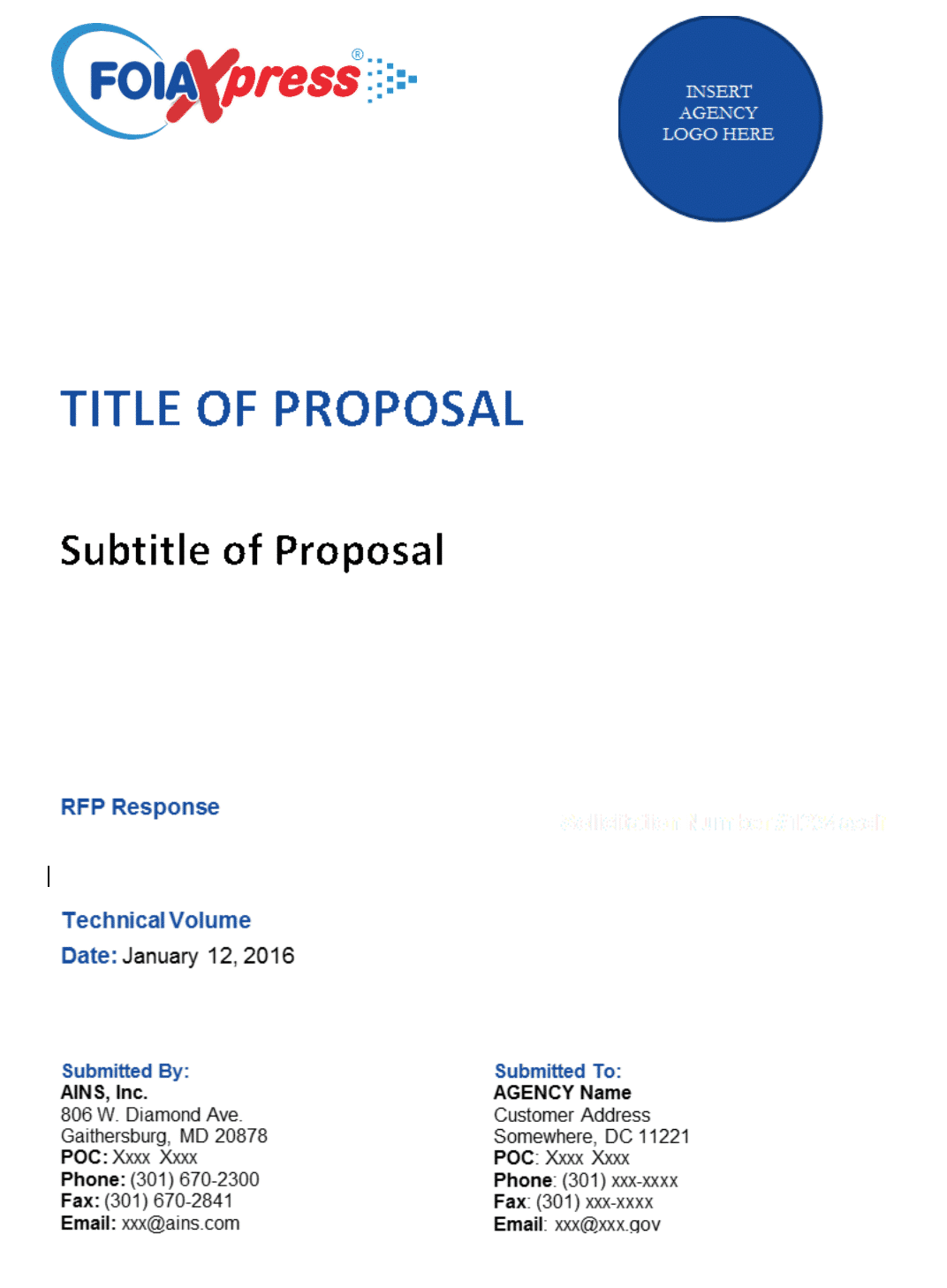
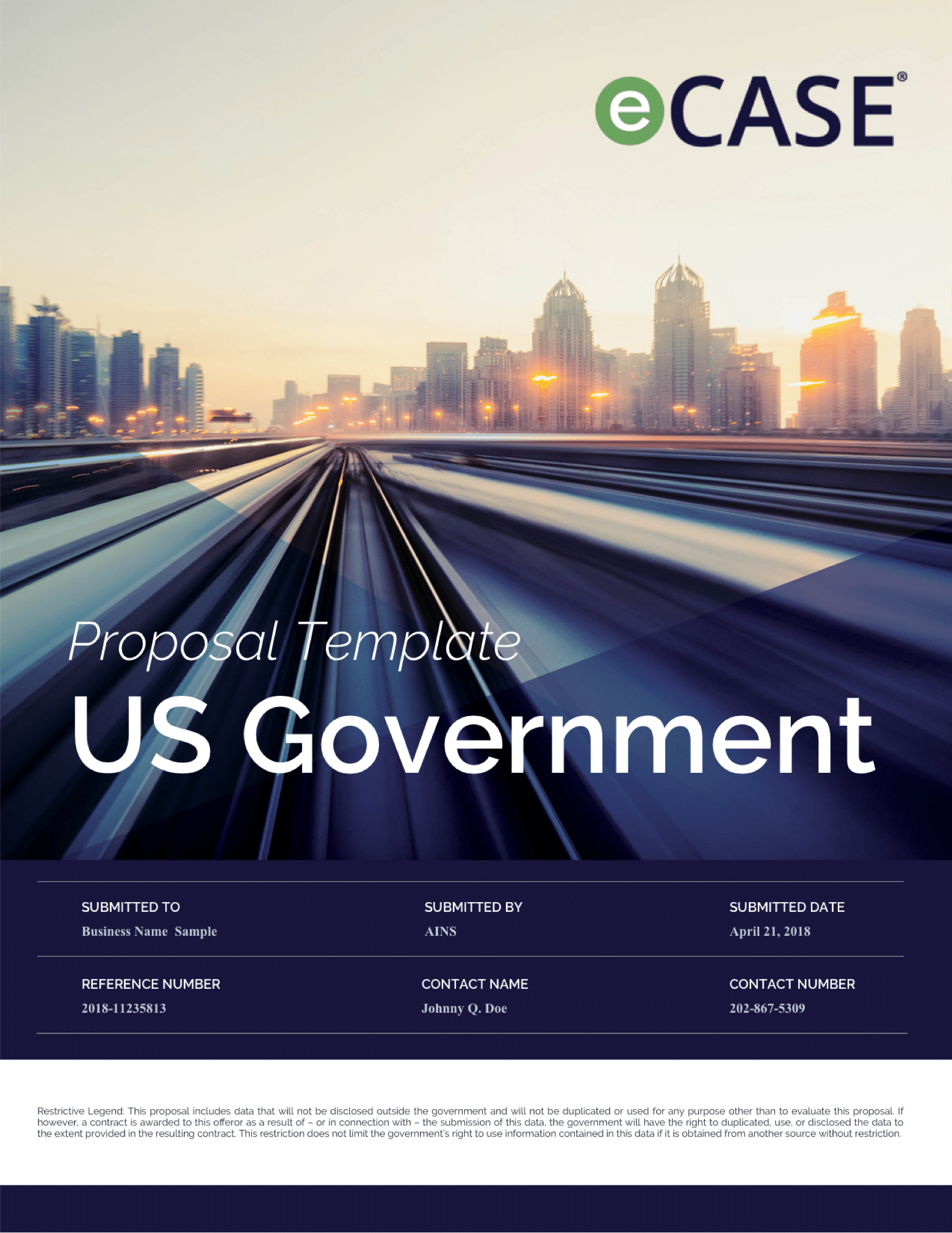
Proposal template
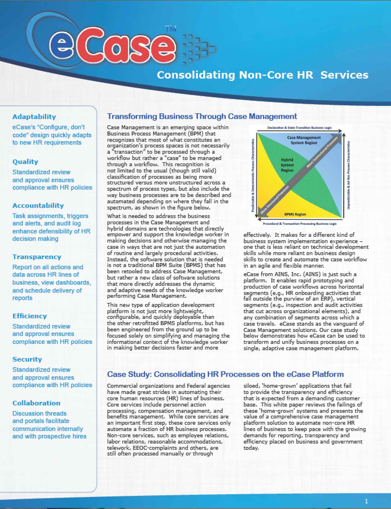
eCase HR software brochure
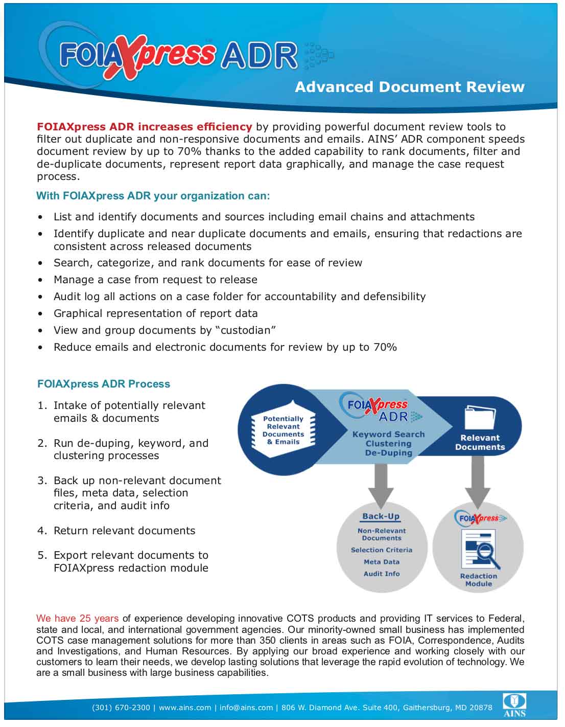
FOIAXpress informational brochure
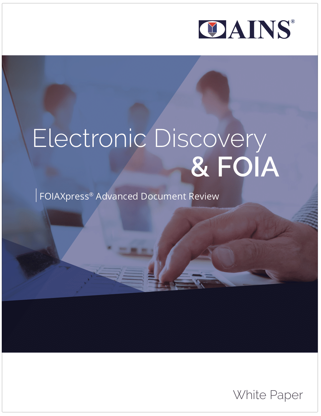
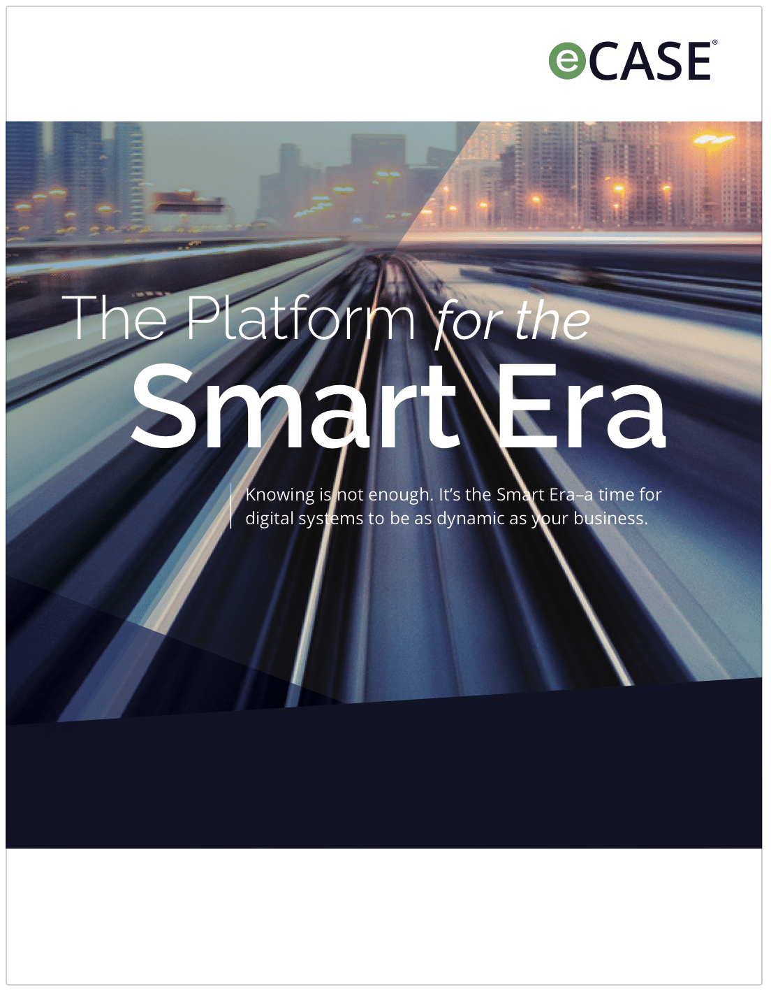
Whitepaper
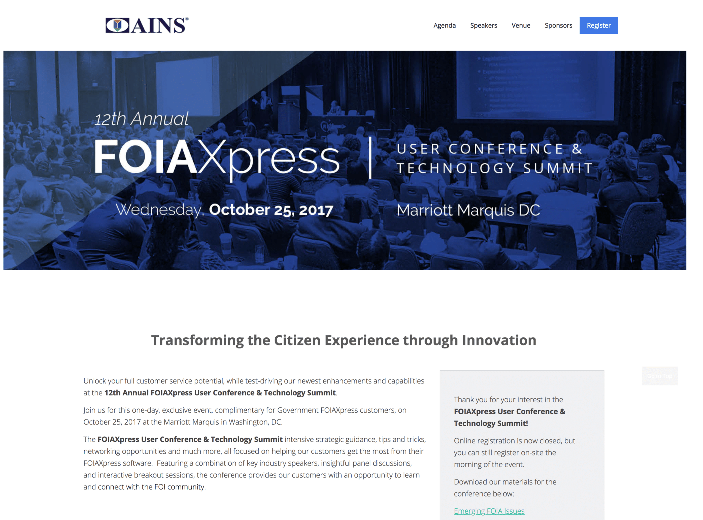
FOIAXpress Conference Website
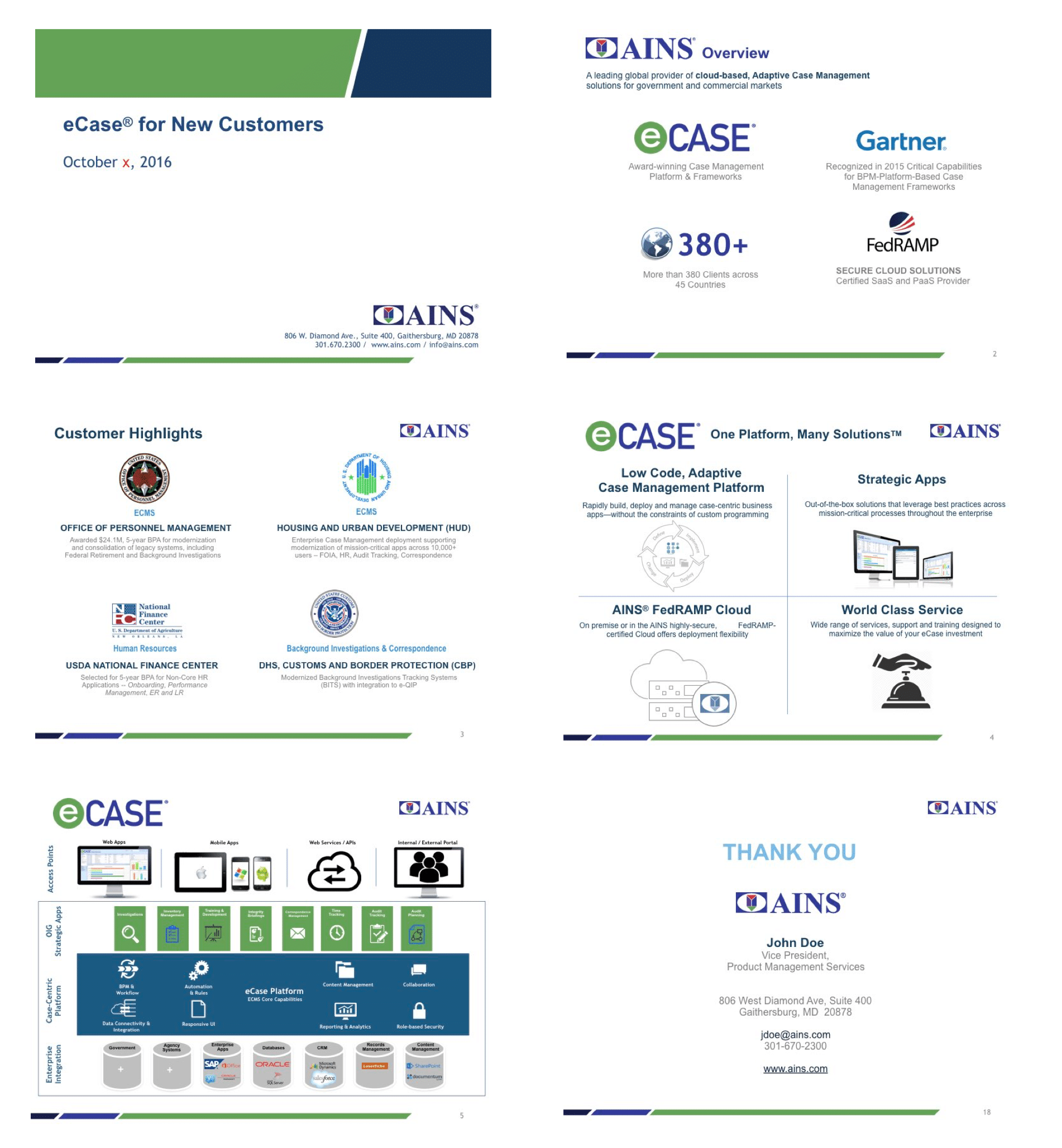
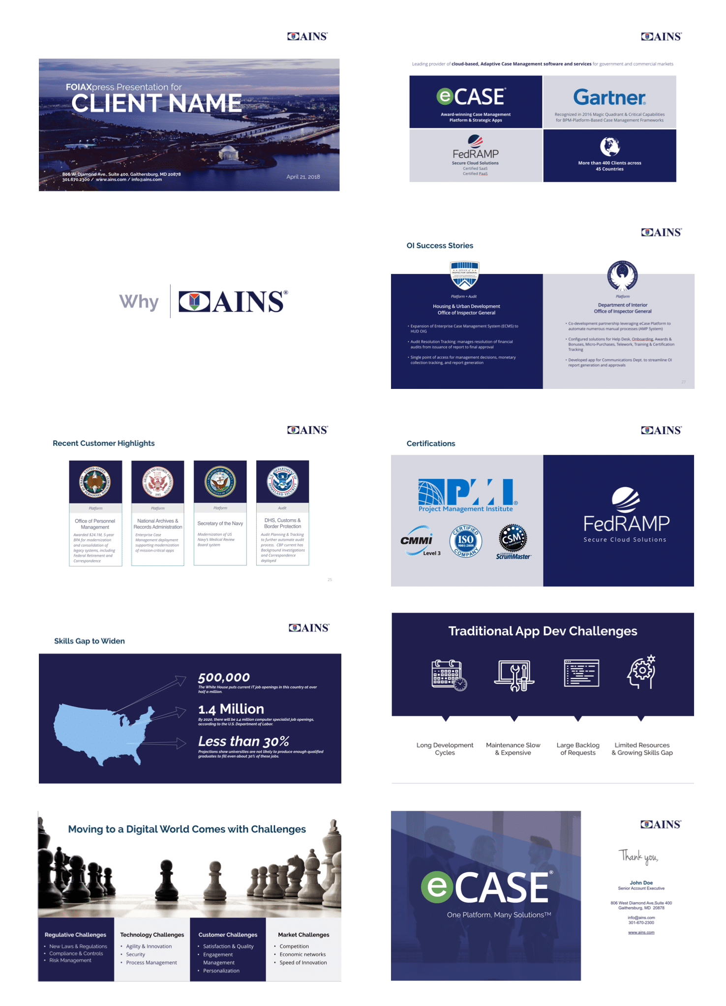
Sample PowerPoint deck
eCase informational brochure
Interested in learning more?
I would be happy to share more details. Let me know how I can help support your next big project. Download my resume and give me a call or text. You can reach me directly at 202-683-7402.